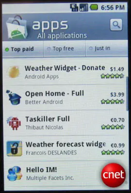
 Over at CNET’s Android Atlas an anonymous source sent in two pictures of what appears to be a completely overhauled UI for Android Market complete with added functionality. In the screen shots you can clearly see a new, vibrant and colorful approach:As you can clearly see, the background color of the entire App Market display is white as opposed to the current black background and white text. Sorting options include Top Paid, Top Free and Just In with the search button being prominently displayed in the upper right. The category display lists apps that are available in the category in smaller/lighter text - I’m not crazy about this as it seems to clutter things up a bit. However, I like the idea of displaying recently searched or often searched keywords and other dynamic info.
According to the article, this Market view was running on a Donut build of Android and most blogs republishing this information say this is the Android Market we can all look forward to later this year. But can we? Seeing as how the leak comes only a week before the big Motorola Android event, perhaps we’re seeing a custom displayed version of the market offered by Motorola. We know they have their own unique offering called Motorola Blur and perhaps THIS is what we are seeing?
This possibility hadn’t been brought up yet and I thought it warranted a mention. I don’t have any information that would suggest one way or the other, but I think the idea that these COULD be the first screenshots of Motorola Blur is definitely a possibility. What do you think?
